Dorfak Olive Oil Label Design
2021-Sep-21
3090
2
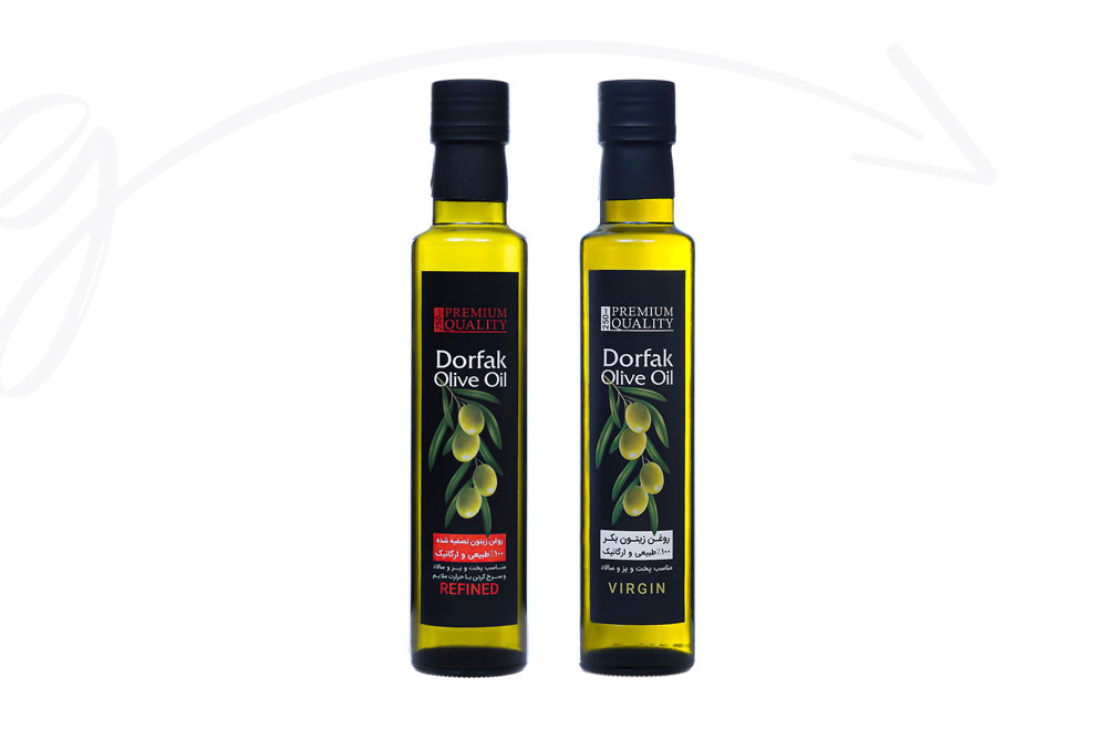
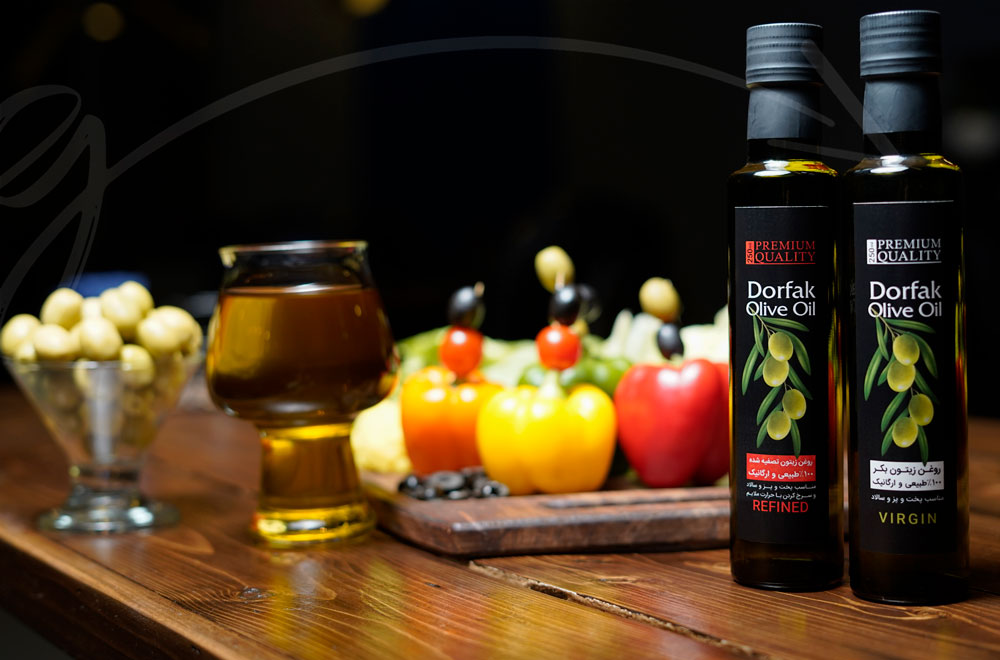
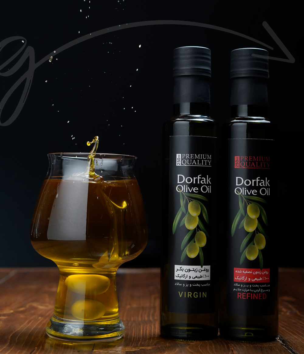
When designing the Dorfak olive oil label, we chose a black background to allow the olive imagery to shine to attract the audience's attention and introduce the product. The olive image was thoughtfully chosen to send the right message, and the leaves around it create an eye-catching appearance. The product and brand name were included in white at the top of the image, clearly visible to the audience.
The bottom elements of the label design needed to be different for two types of products: VIRGIN and REFINED (roasted and odourless oil). To differentiate between the two, we used white for the VIRGIN label and red for the REFINED label.


Comments(0)