Salman Beverage Packaging Design Project
Breaking Away from Conventional Juice Packaging and Creating a Character-Driven Product Family
In the Salman Beverage Packaging Design Project, the goal was not simply to create attractive packaging, but to develop a distinctive visual language for the brand—one that could stand out quickly, remain memorable, and establish an emotional connection with the audience.
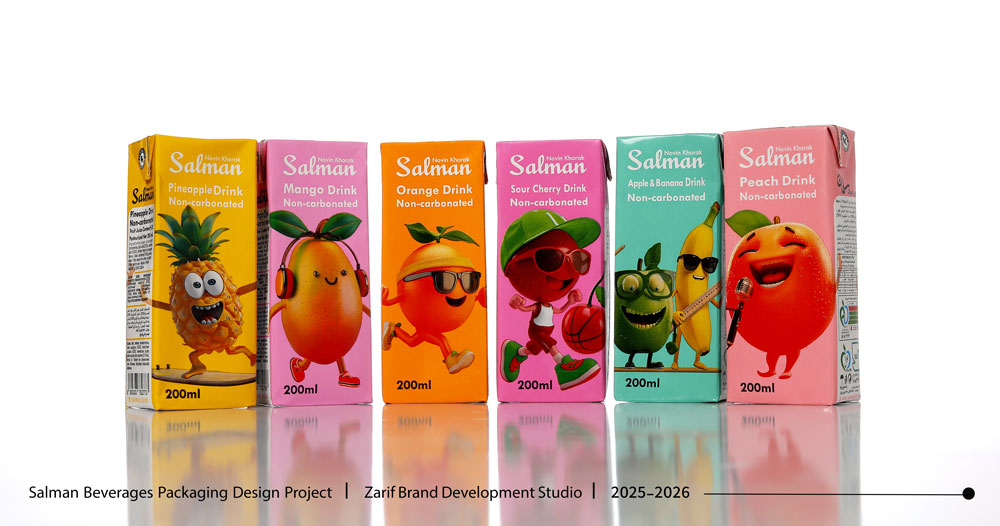 In the beverage market, a significant number of packaging designs still rely on the direct representation of fruit and flavor names. Even in more creative examples, this familiar structure is often maintained. For this project, our approach was to move beyond this conventional formula and transform fruits into independent characters with distinct personalities. Salman embraced this direction, creating an opportunity to build a more distinctive and recognizable brand identity.
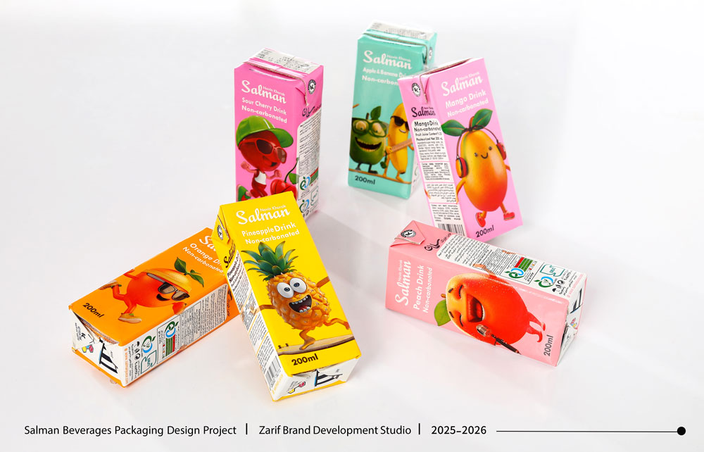
Character Design; Fruits with Distinct Personalities
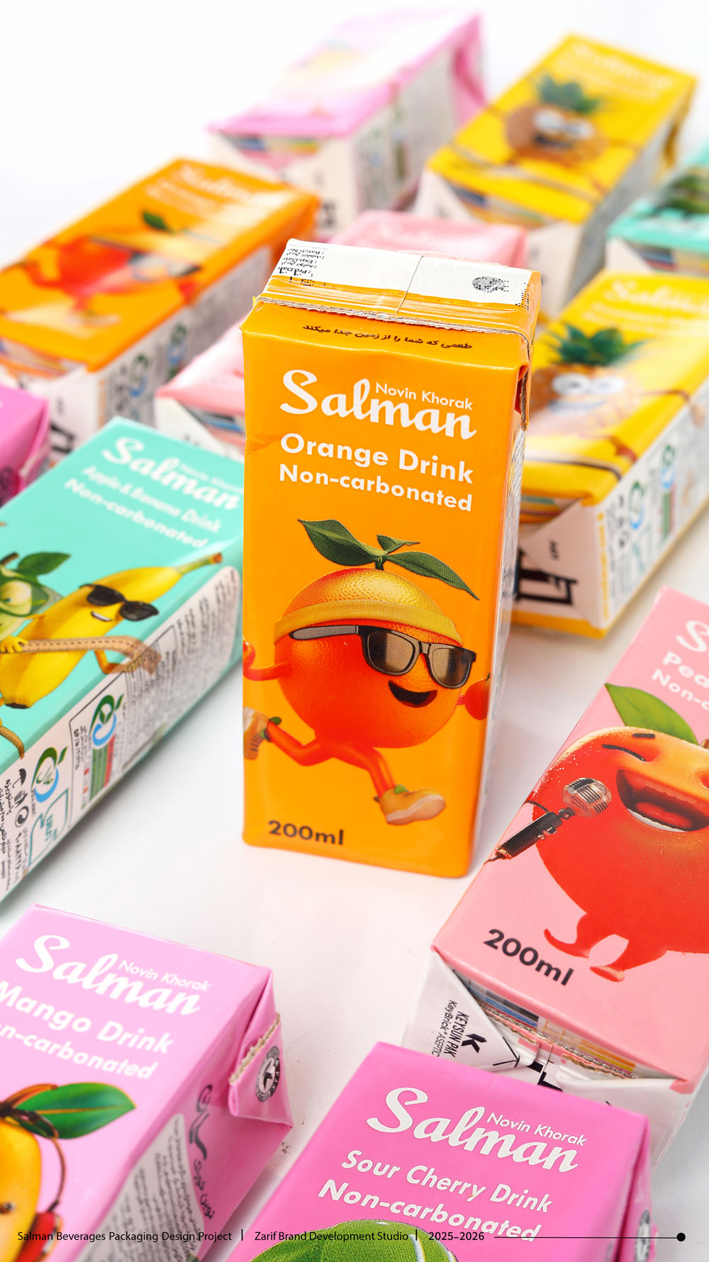
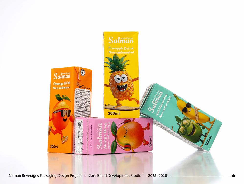
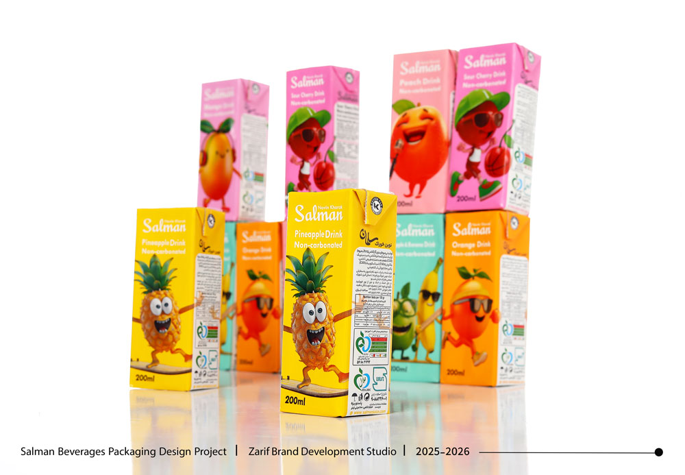
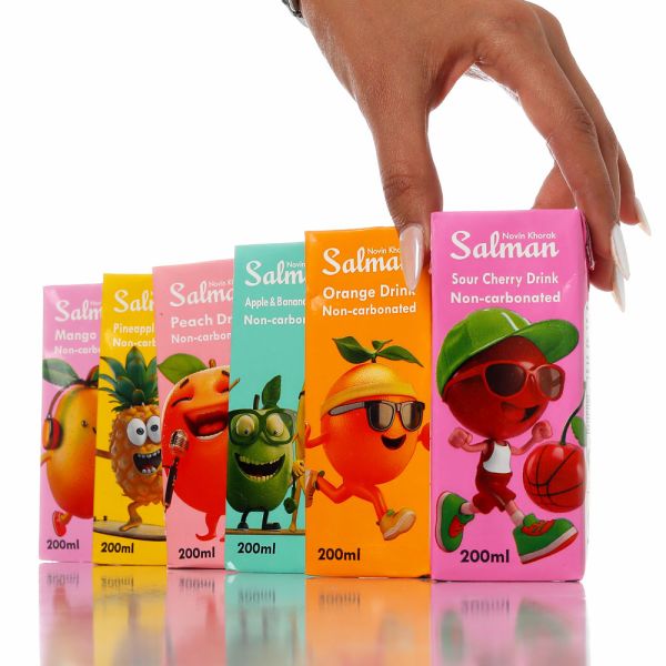
In this system, each flavor has its own dedicated character. The fruits are no longer simply visual representations of flavor; through facial expressions, gestures, accessories, and personality traits, they become lively, energetic, and memorable characters.
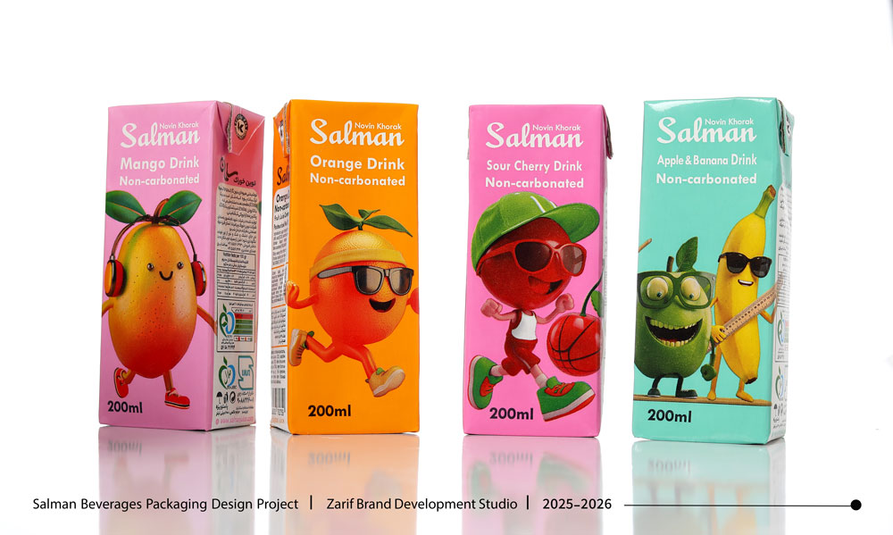
Combined with bright and diverse colors, these characters give each product its own identity while allowing the entire range to be recognized as a cohesive visual family.
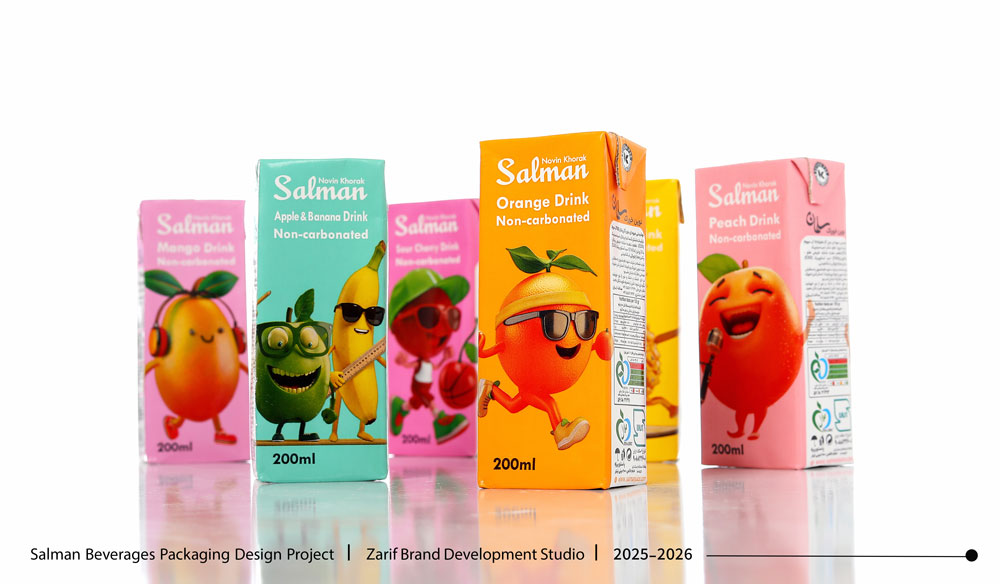
Color & Illustration; Creating Instant Visual Appeal
Each flavor was assigned a vibrant and energetic color to ensure quick recognition on the shelf. The combination of engaging colors, playful characters, imaginative illustrations, and moments of humor and playfulness transforms the packaging from a purely informative product surface into an engaging communication tool.
This approach makes the products particularly appealing and relatable to children, teenagers, and a segment of Gen Z audiences.
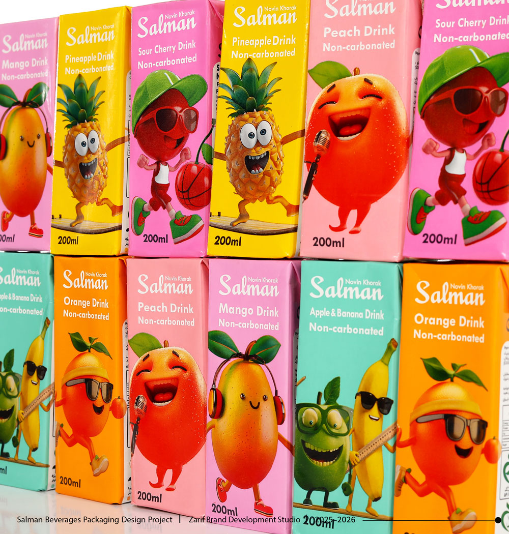
One Visual System, Multiple Unique Characters
Despite the differences in flavor and character personality, the logotype placement, information hierarchy, typography, and graphic language remain consistent across the entire packaging range.
As a result, each product has its own personality while all products work together to form a distinctive, recognizable, and cohesive product family.
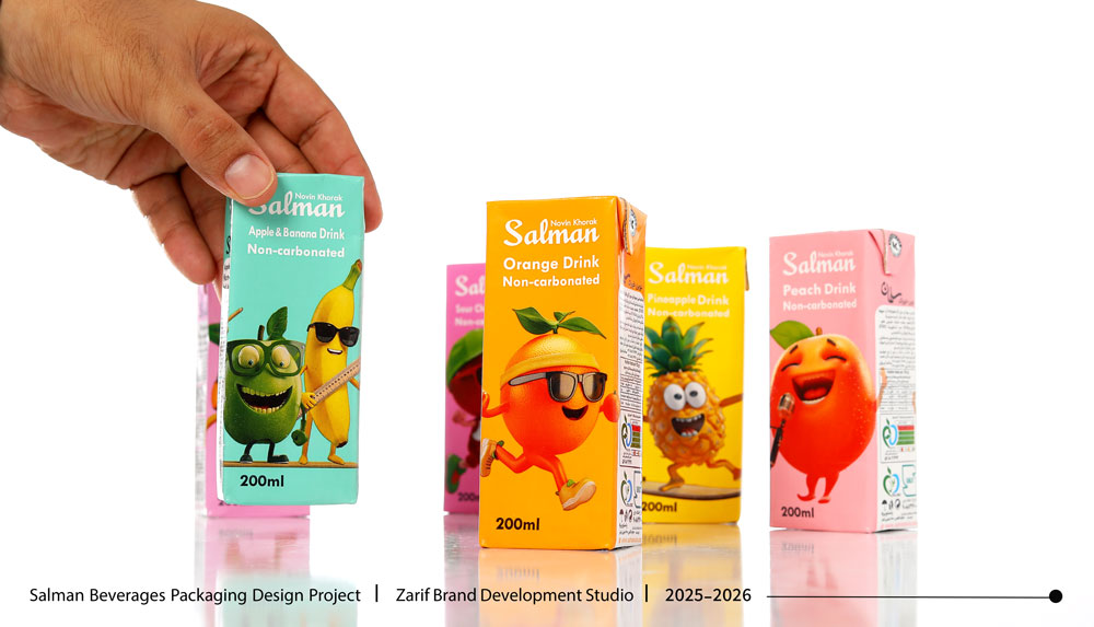
Project Details
Studio Services: Ideation, Concept Development, Packaging Visual Identity, Illustration, Character Design, Product Visual System Design, and Print Preparation
Core Concept: Transforming fruits from repetitive visual elements into distinctive and relatable characters
Design Style: Playful, creative, imaginative, modern, and character-driven
Visual Elements: Vibrant colors, fruit characters, fantasy-style illustration, typography, and a cohesive packaging structure
Key Differentiator: Moving beyond the conventional “fruit + flavor name” formula and creating a character-driven visual language for the brand
Services: Ideation, Concept Development, Visual Identity & Packaging Design, Label Design, Character Design, Illustration, and Product Photography.
Comments(0)