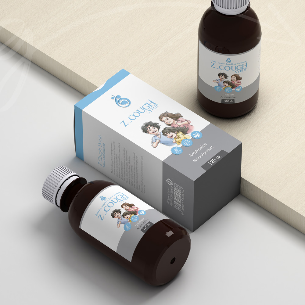
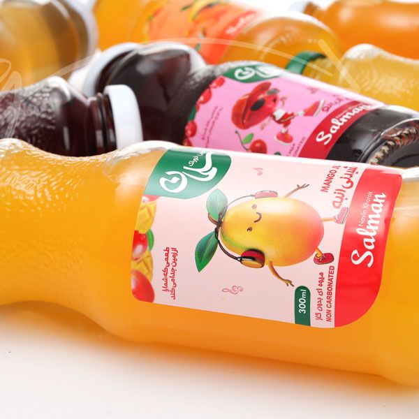
The rebranding journey of Zojaj Darman Tous that started in 1402 first month and extended until mid-summer was a captivating endeavor. Their product range catered to children and adults seeking to enhance their vitality and well-being. Curating a unified visual identity amidst such diverse offerings posed its own set of challenges. Drawing from our designing background in the industry, we understood the nuances of engaging with their audience effectively.
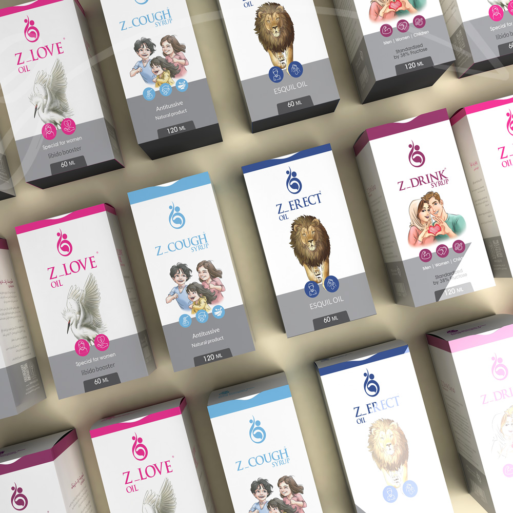
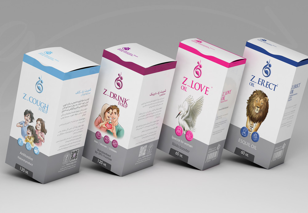
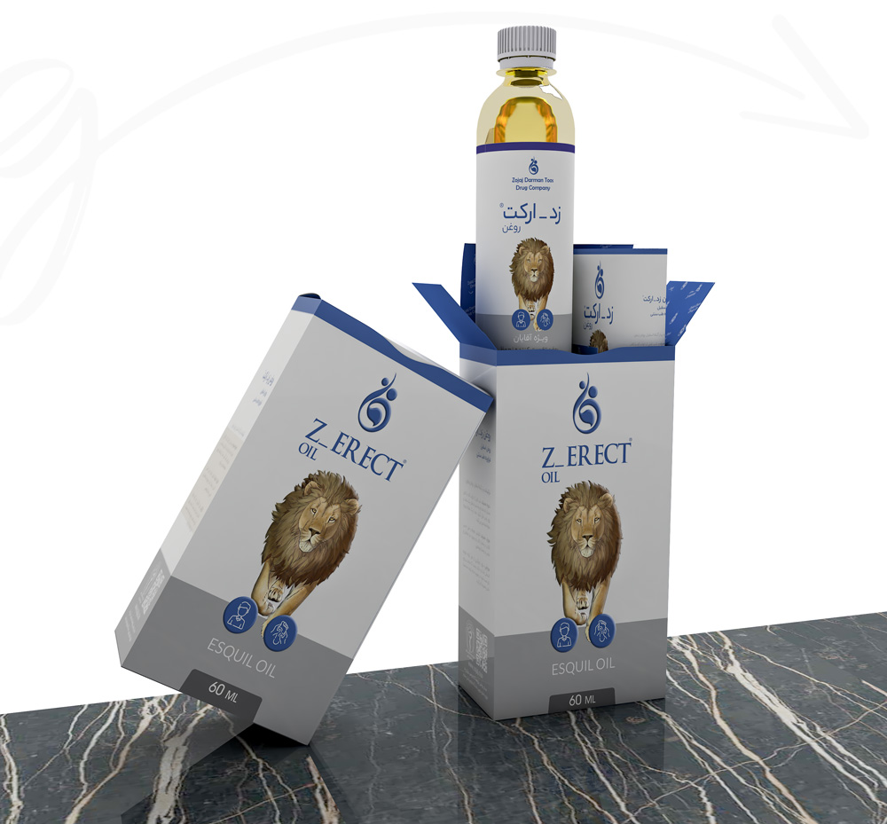
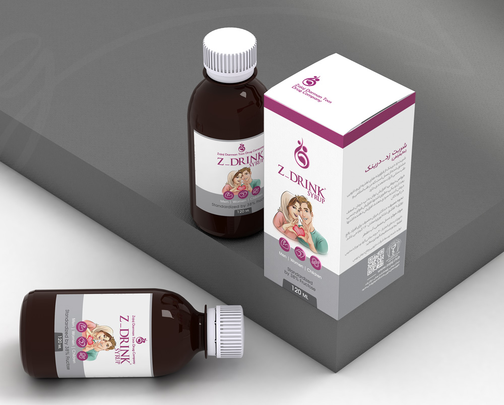
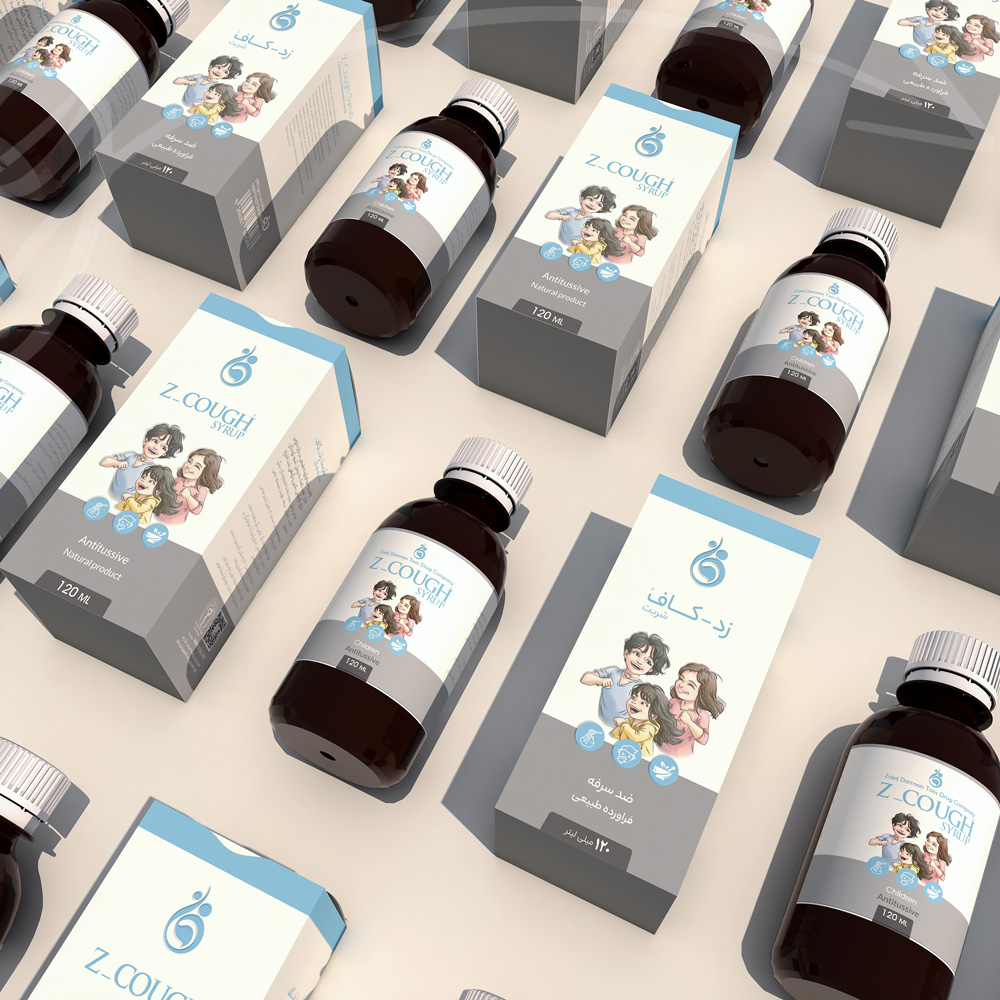
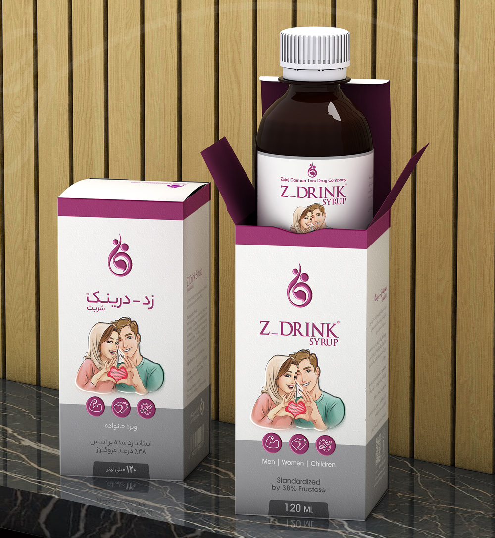
In the bustling market, conventional symbols like the Eiffel Tower, gender icons, and arrows often adorn product displays for men and women. However, for Tous Pharmaceutical's packaging, we opted for unique concept characters that exuded elegance and embodied the products' improving properties.
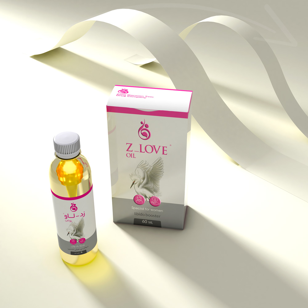
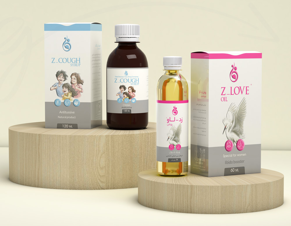
Navigating cultural sensitivities in character depiction in Iran was paramount. While using fruits could have been an option, the licensing process might have been prohibitive. As a solution, we crafted custom characters like a peacock for women, a lion for men, a joyous couple for partners, and varied characters of children to tailor to a wider audience range.
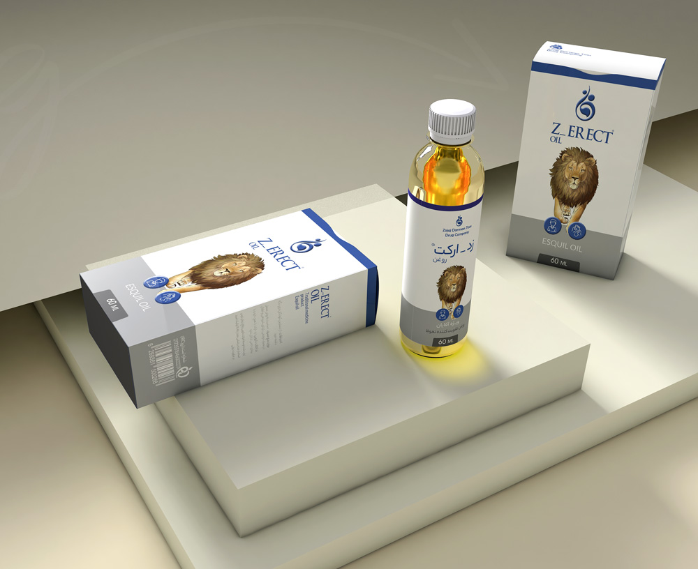
Each product's color palette was meticulously chosen to reflect its essence and benefits. Furthermore, we ensured a harmonious visual language across all rebranding components such as brochures, bottle labels, advertising materials, and product catalogs.
Through thoughtful design and strategic creativity, the new packaging for Tous Pharmaceutical now stands out as a beautiful representation of their diverse product line.
Comments(0)