Divine Saffron brand visual identity design
Divine Saffron Logo Visual Identity Introduction
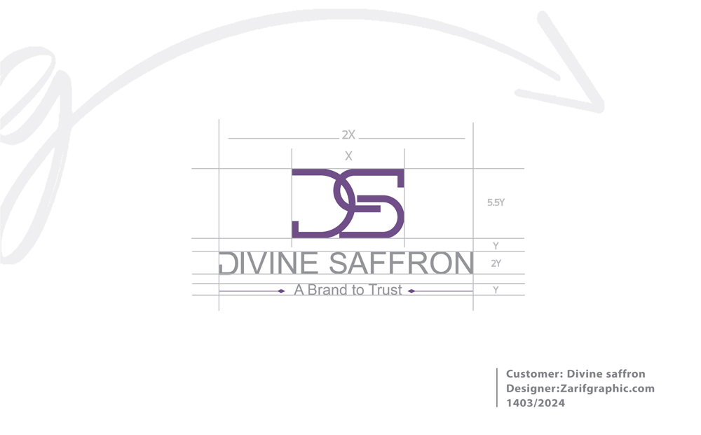
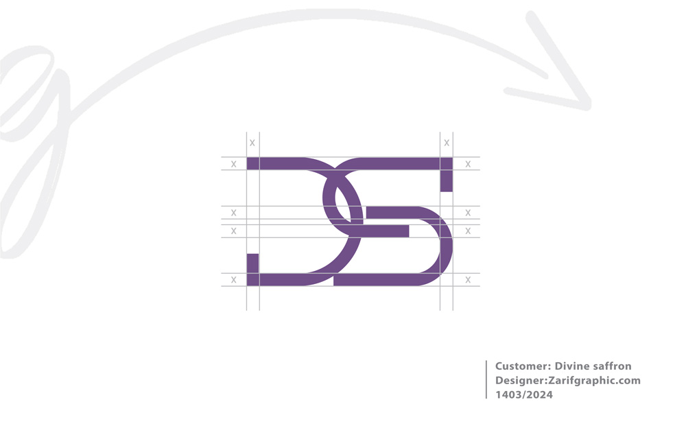
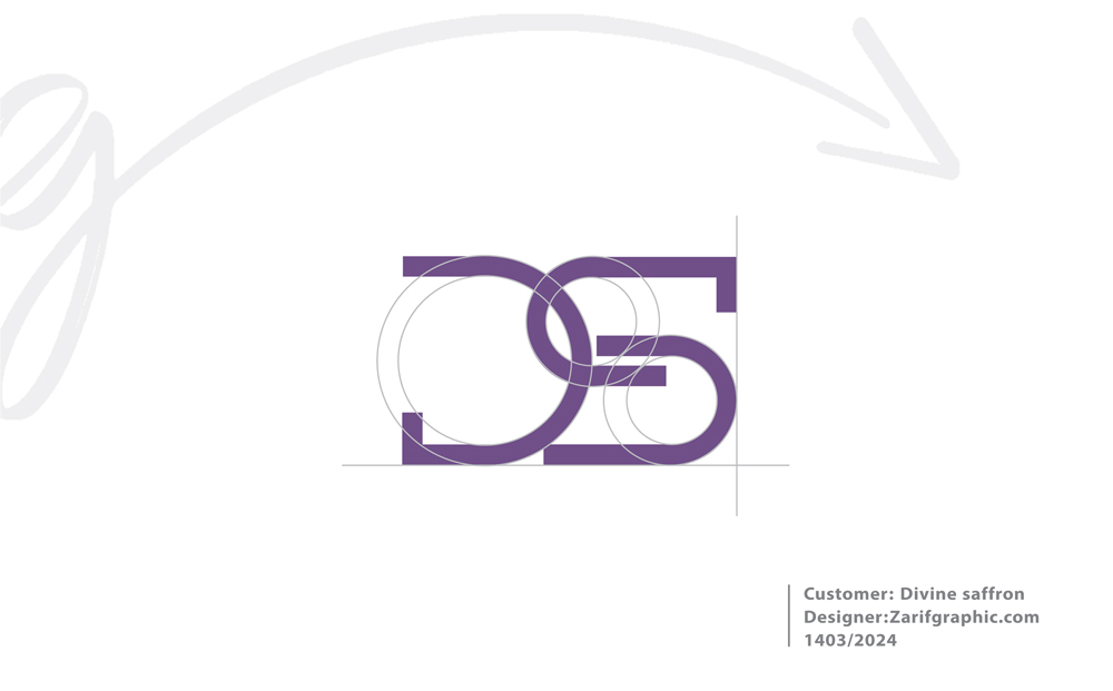
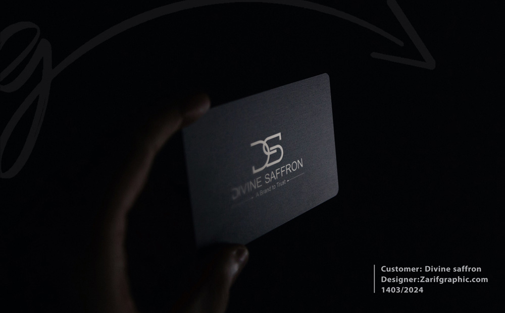
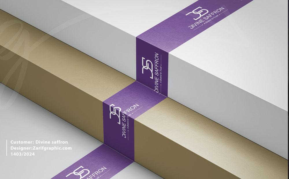
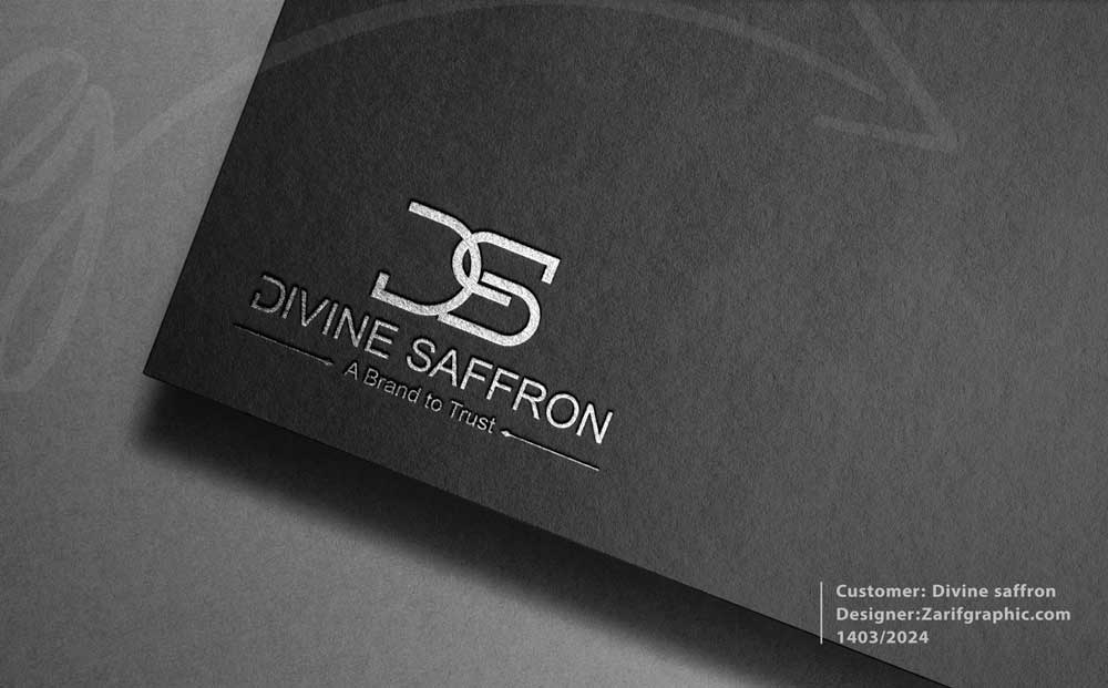
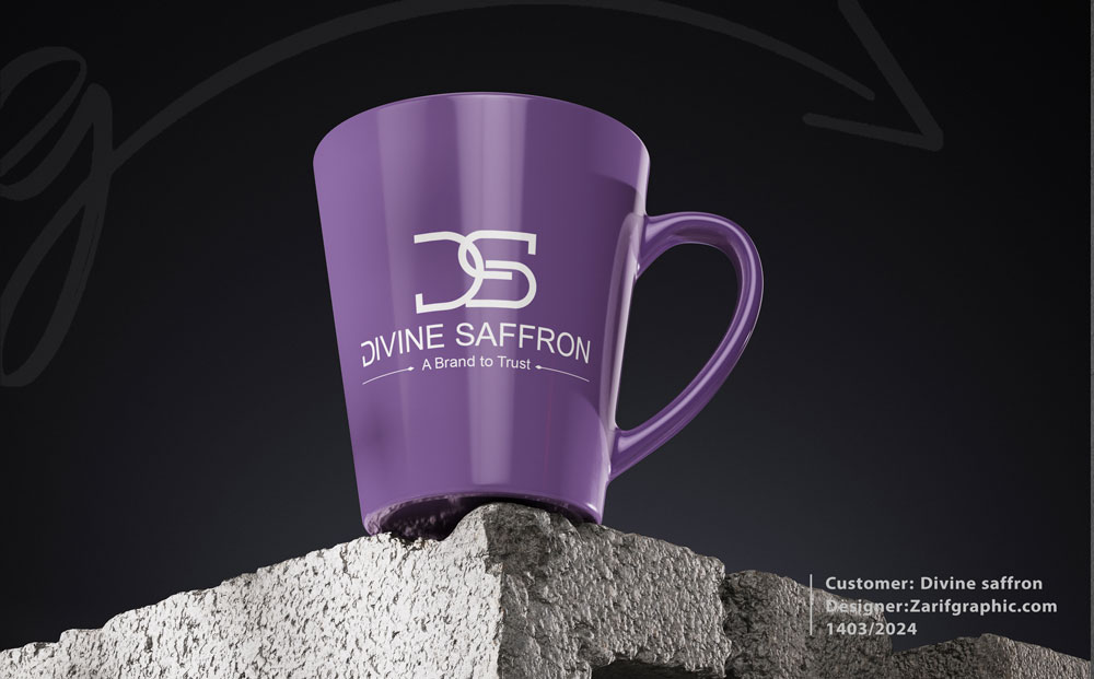
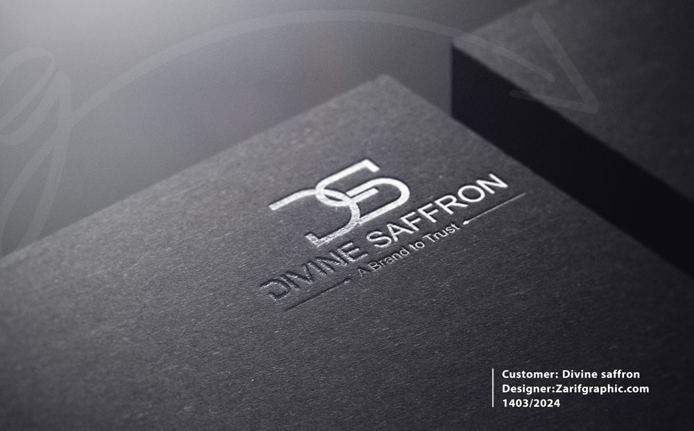
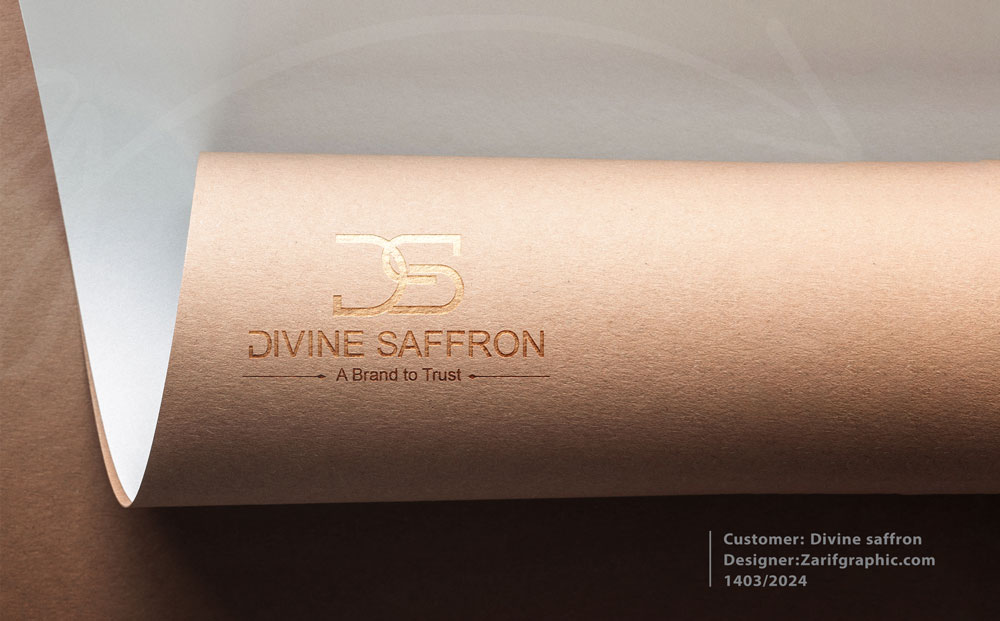
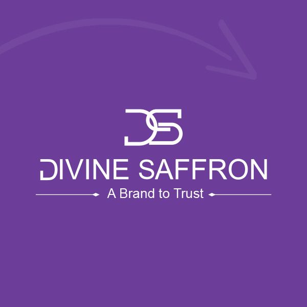
The Divine Saffron logo is designed by integrating the initials D and S. This combination creates a unique and memorable structure through precise, geometric design, clearly showcasing the brand's identity. The controlled overlap of the two letters signifies the interaction between the product's authenticity and the innovation in its presentation.
The logo's color palette includes shades of purple and gray. Purple is associated by the audience with premium saffron, a sense of luxury, high quality, and positive energy. Gray reinforces a feeling of trust, stability, and professionalism. This color combination was chosen to convey the personality of a premium and reputable brand.
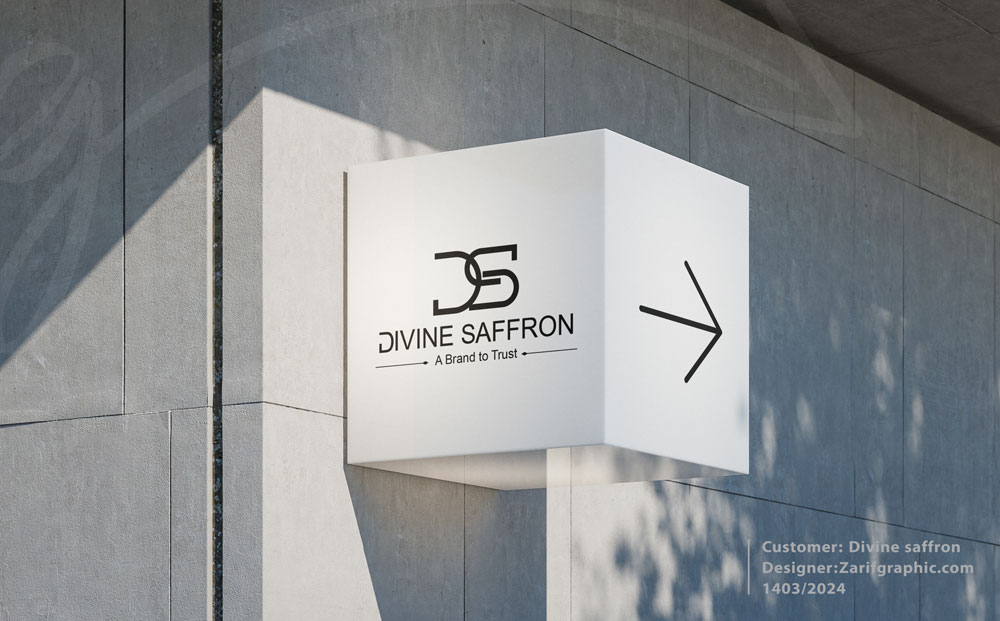
The text "DIVINE SAFFRON" is designed with a modern and minimalist font to maximize readability in the international market, especially for American audiences. The slogan "A Brand to Trust" is positioned beneath the logo, expressing the core brand values: trust, health-centricity, and commitment to genuine quality.
The use of horizontal lines on both sides of the slogan symbolizes balance, structure, and the brand's purposeful movement, completing the logo's visual coherence.
The final result is a visual identity that clearly communicates the following message: Divine Saffron is a premium and trustworthy saffron brand for global audiences.


Comments(0)