Comprehensive Logo and Visual Identity Design for Dr. Haniye Kazemi
Branding in the medical and dental fields goes far beyond simple visual display; it serves as a vital communication bridge to convey trust, expertise, and a sense of calm to patients. In the visual identity and medical logo design project for Dr. Haniye Kazemi (Orthodontist and Maxillofacial Orthopedics Specialist), our primary objective was to create a modern, scientific, yet welcoming image that introduces her specialized expertise at first glance.
The design team at Zarif Brand Development Studio set out to blend minimalism with precise visual cues, creating a complete brand identity package that includes a custom logo, bespoke typography, and an integrated corporate stationery design.
Conceptual Identity & Key Elements of the Branding Package
An intelligent medical design must strike a perfect balance between "science and aesthetics." Below, we explore the different facets of this visual identity architecture:
1. Orthodontic Symbology in the Logo Monogram
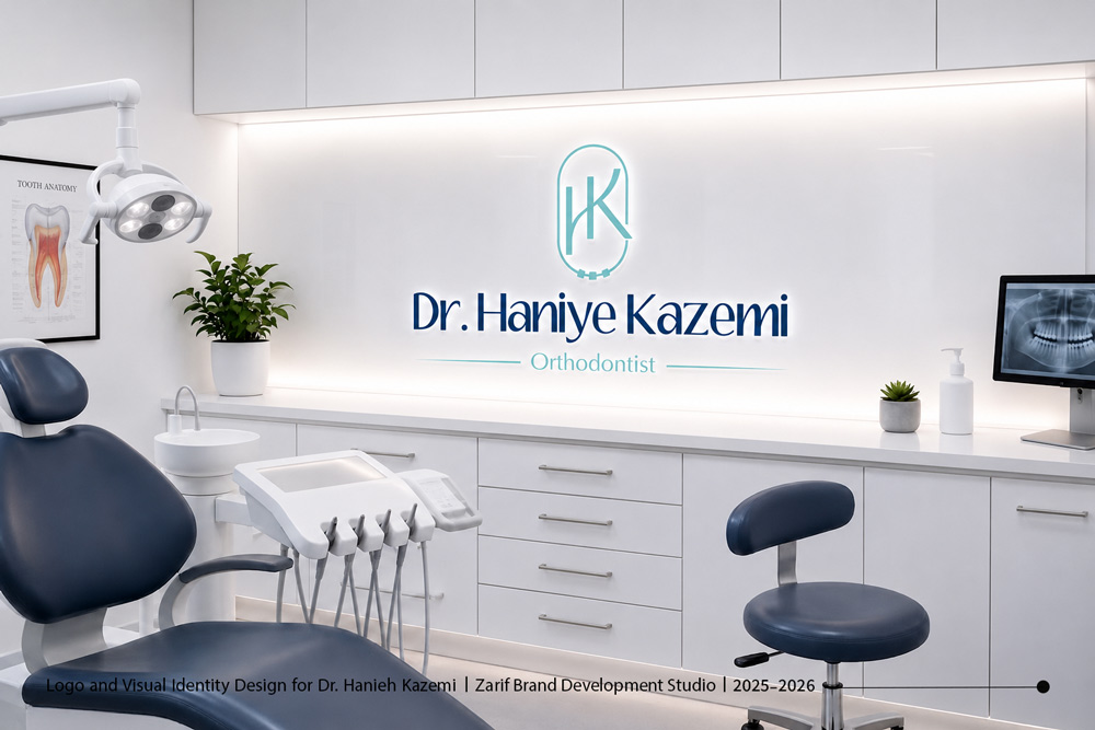
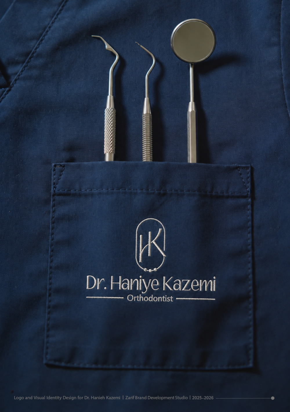
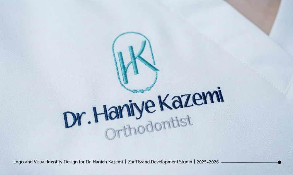
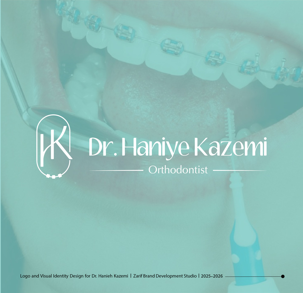
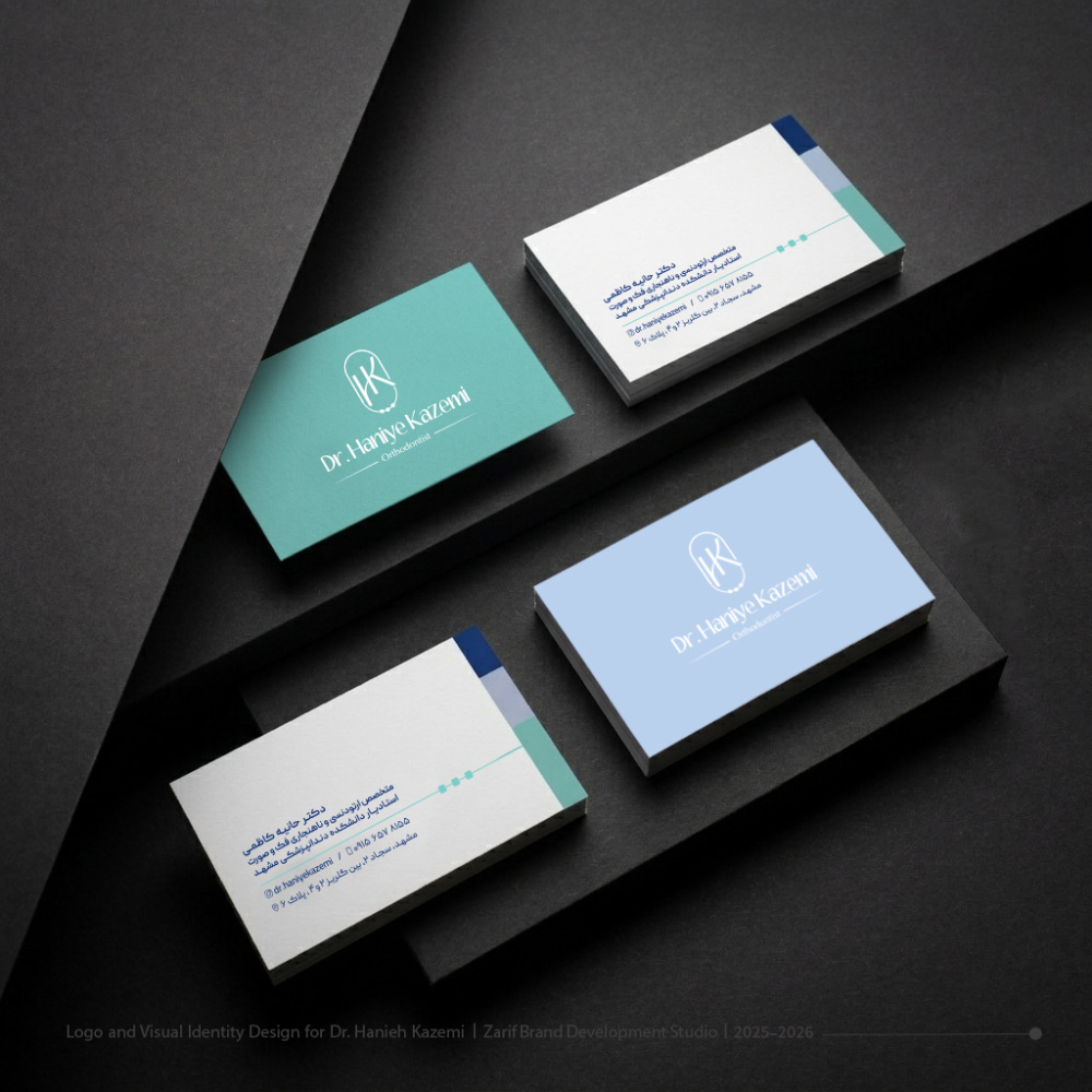
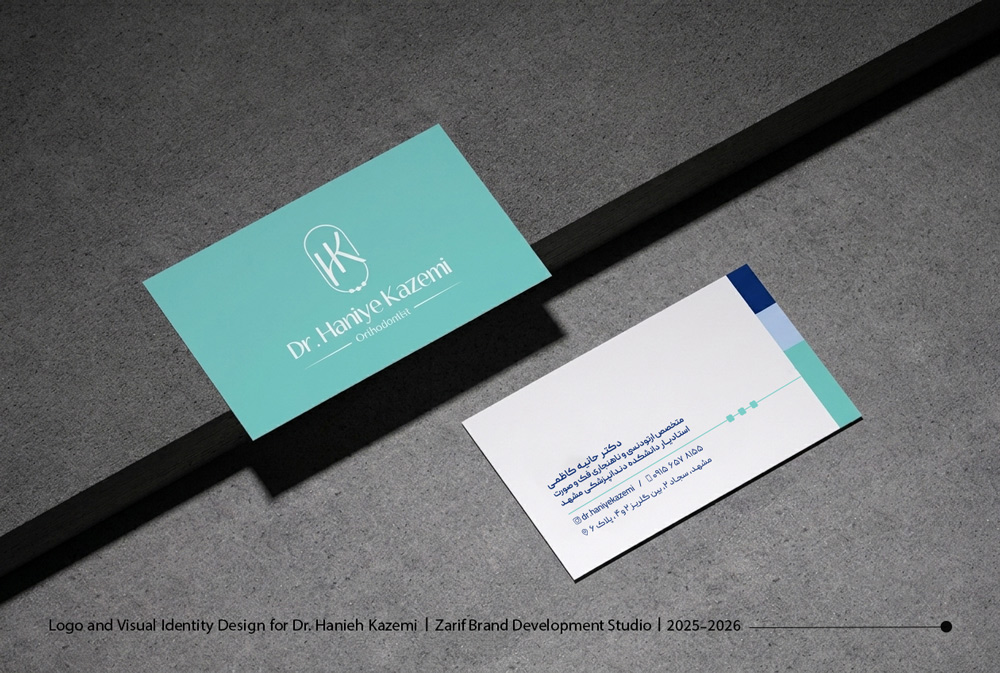
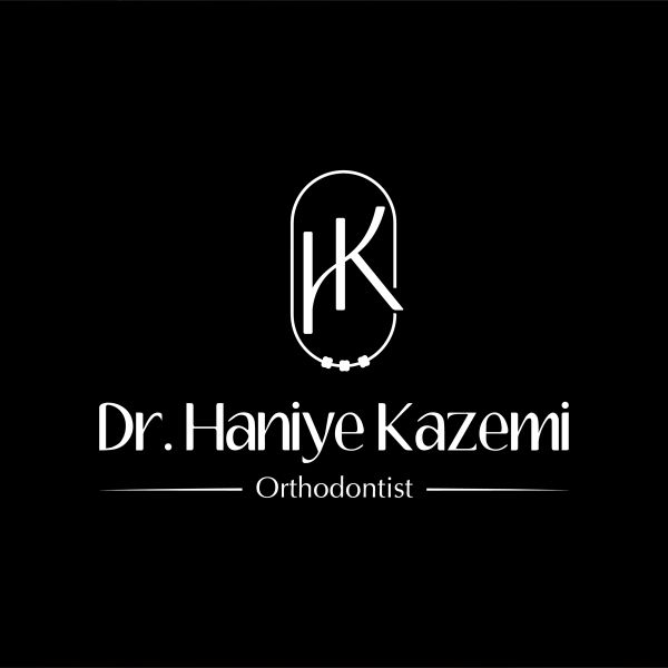
The most prominent feature of this logo is the clear integration of specialized medical elements. By combining a monogram of the doctor’s initials (H and K) with the symbolic form of orthodontic brackets and archwires, we created a truly unique structure. The soft lines and the oval geometry of the frame not only evoke a row of aligned teeth but also reflect harmony, order, and a confident smile.
2. Pastel Color Palette; Calm, Cleanliness, and Modernity
Color selection in healthcare environments plays a crucial role in reducing patient anxiety. For Dr. Kazemi’s visual identity, we utilized a minimal pastel palette based on light mint-aqua, deep navy blue, and soft beige. In addition to inspiring the hygiene, cleanliness, and tranquility of modern dental practices, this combination presents a distinct and elegant visual identity compared to the traditional, rigid colors often used in this industry.
3. Modern and Legible Typography
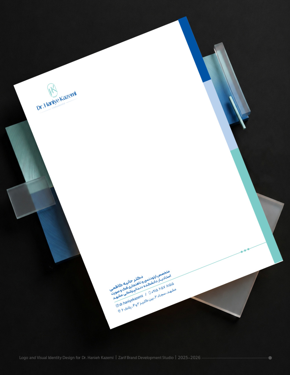
The monogram logo design is paired with custom, modern English typography. The selected font features subtle contrast in stroke weights, giving the brand a luxurious and academic feel while maintaining exceptional legibility in smaller applications such as business cards or letterheads.
4. Integrated Stationery & Practical Assets Design
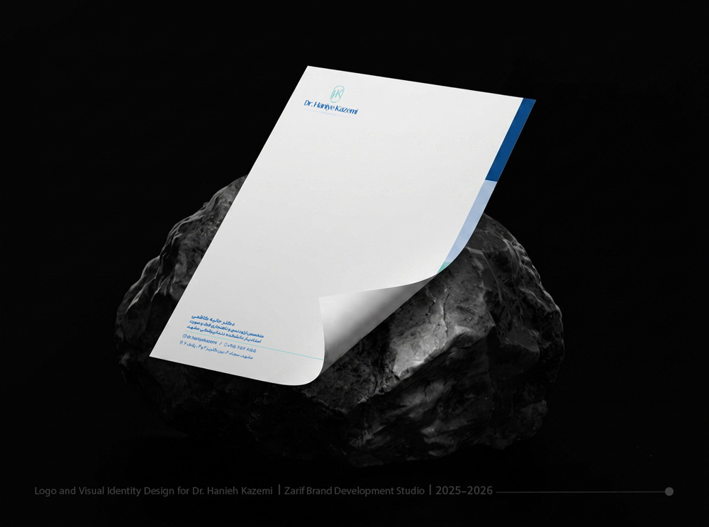
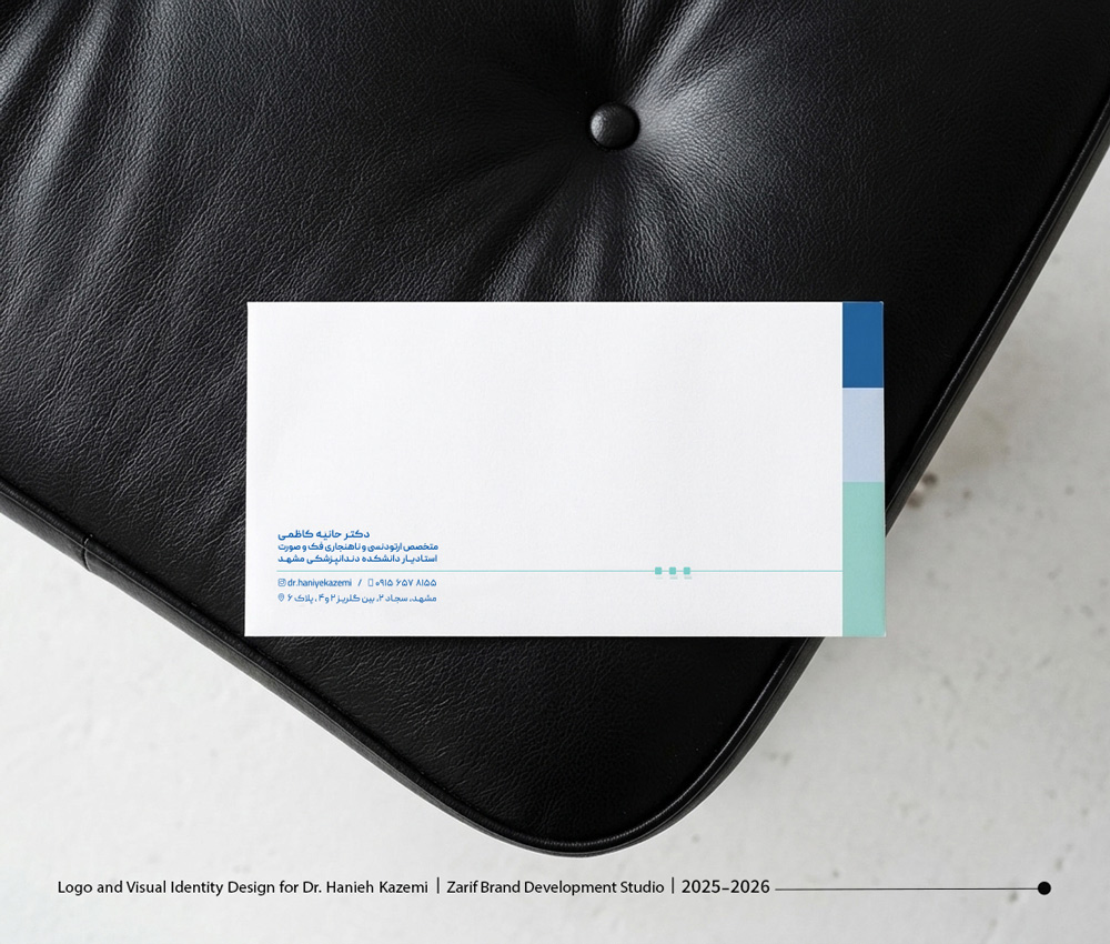
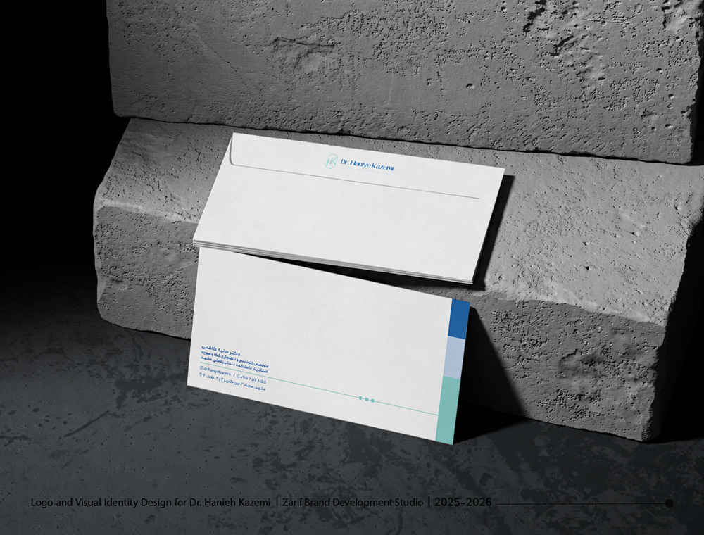
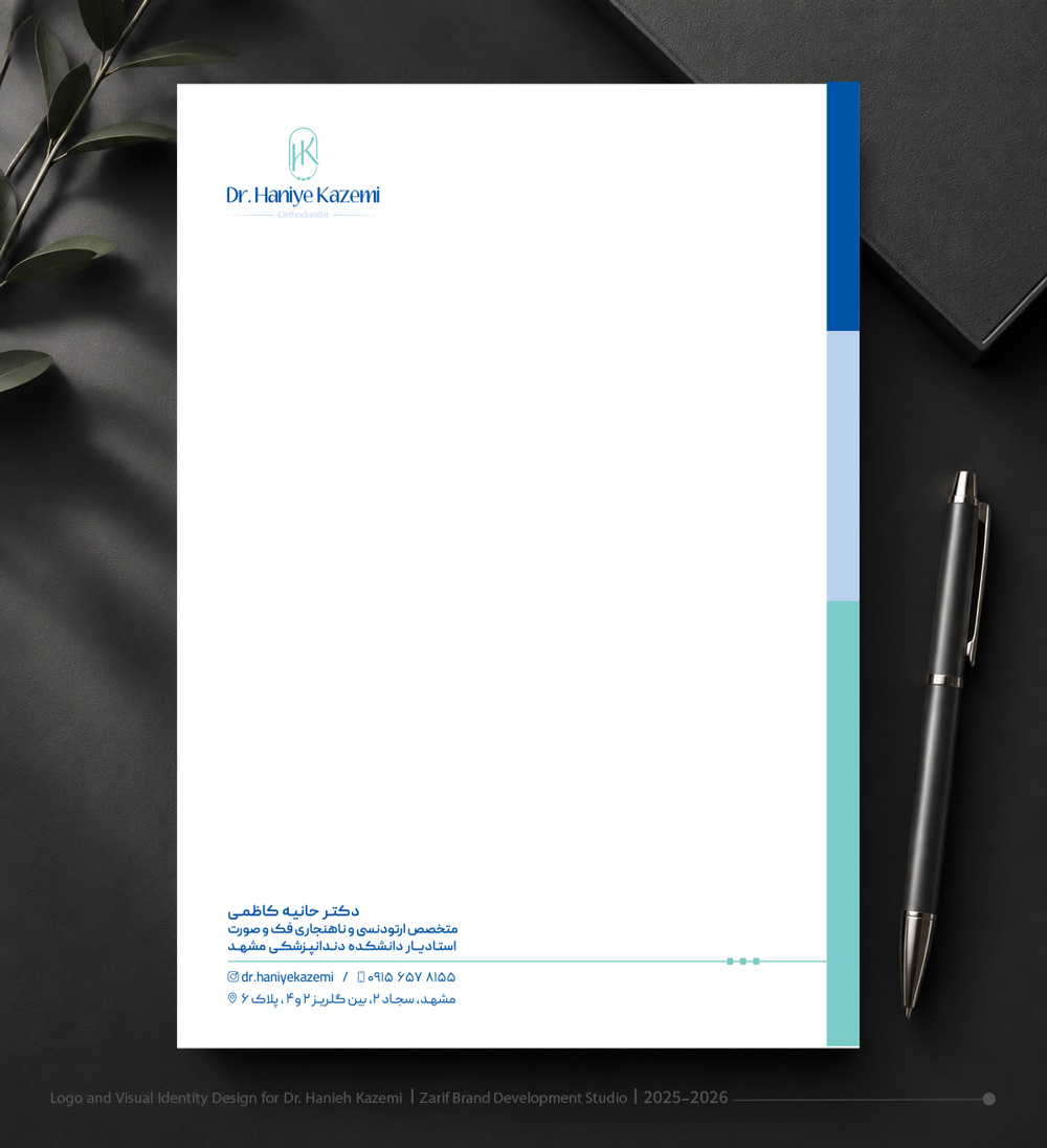
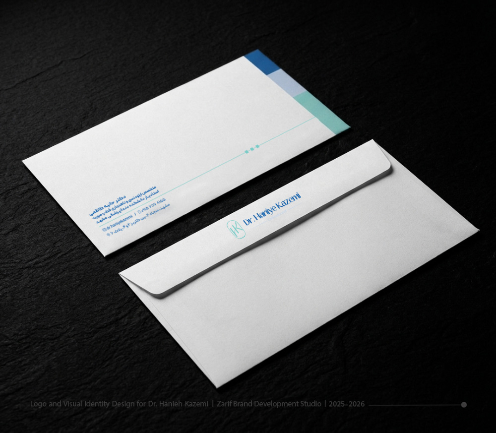
A physician’s visual identity is fully realized when a patient holds their prescription, letterhead, or business card. In the stationery design for this project, we implemented a clean, spacious grid layout with delicate guide lines. The colored accent strips and the small trio of icons on the margins serve as a consistent visual signature, tying every detail of the clinic together—from medical letterheads to business cards.
Technical Specifications at a Glance
The structure and services provided in this project are outlined below:
- Project Title: Visual Identity & Bespoke Logo Design for Dr. Haniye Kazemi
- Studio Services: Visual Identity Overhaul & Creation, Monogram & Logotype Design, Corporate Stationery Design (Business Card, Letterhead, Envelope, and Prescription Sheet)
- Design Style: Modern, Minimal, Line Art
- Color Palette: Pastel Tones (Light Aqua-Green, Dark Navy Blue, Grey, and White)
- Concept & Execution: Zarif Brand Development Studio


Comments(0)