Zal Horse Farm Logo Design
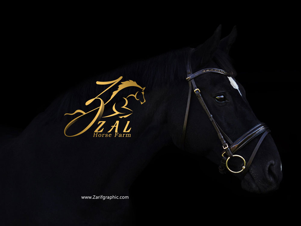
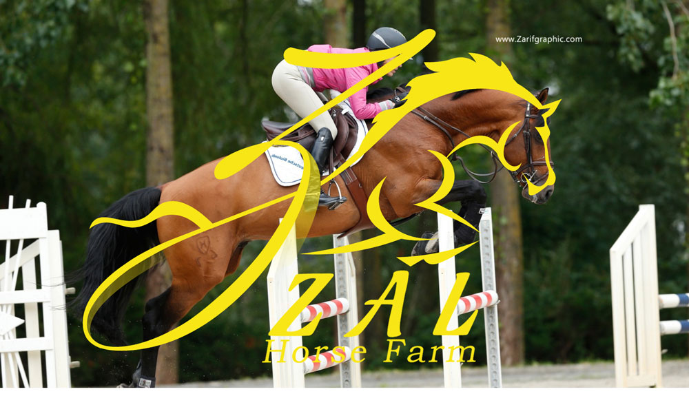
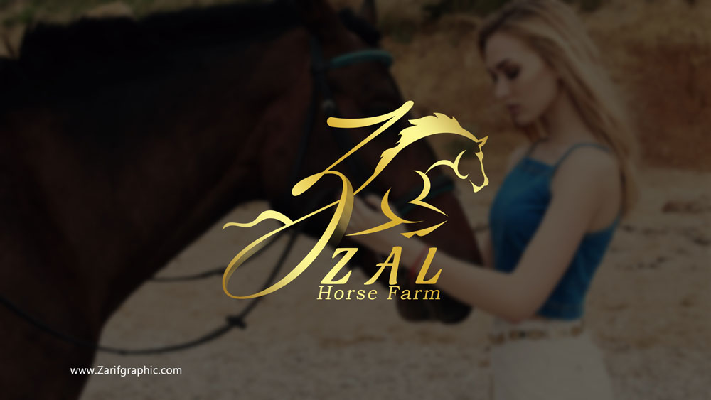
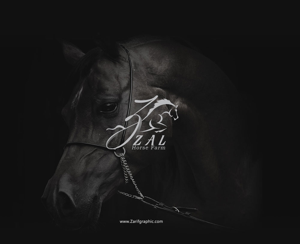
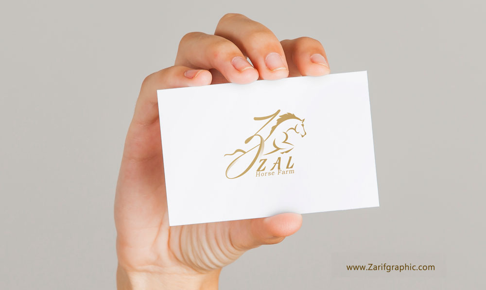
Zal Horse Farm logo design is detailed and simple at the same time. We knew that the logo’s beauty and natural identity would only show when it can symbolize the brand’s niche.
Drawing a characteristic shape of a horse that can represent power, speed, glory altogether wasn’t exactly easy. But it wasn’t a real challenge up until we realized we had to fit the letter “Z” Into the design element.
At first, the letter didn't seem like it would go with our initial design. We had to create a central structure in the logo by analyzing different shapes of “Z”. It was a very time-consuming process, but we knew it was worth it by the time we saw our client’s reaction.
We managed to structure the logo as the horse rider. Presenting the letter Z as a rider, seemed like the perfect fit. But that wasn’t the end of it.
For a better introduction, we additionally added a typo Which made the logo self-explanatory for the brand's name (Zal) and its niche (Horse Farm).


Comments(0)